The next major iPhone software update, iOS 27, will be introduced on June 8, and rumors suggest it will bring at least two changes to the Liquid Glass design.
#1: New System-Wide Liquid Glass Slider
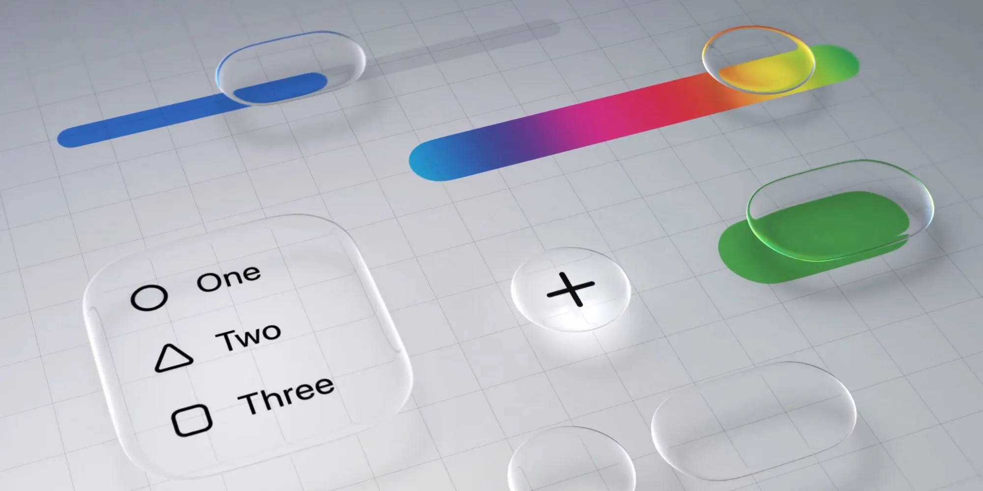
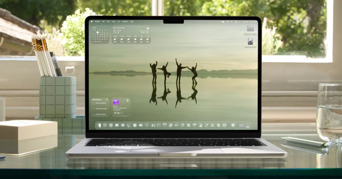
Currently, in iOS 26, Apple offers a primary option to customize the system-wide Liquid Glass appearance.
Settings ⇾ Display & Brightness ⇾ Under Liquid Glass, two styles are available:
- Transparent
- Colorful
While Transparent gives a full, clear effect to the Liquid Glass, the Colorful version significantly increases opacity, providing a look closer to the design of iOS 18.
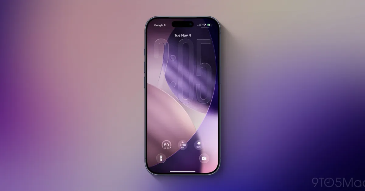
However, according to Mark Gurman from Bloomberg, Apple has always planned to implement a Liquid Glass slider that allows users to fine-tune the levels of transparency and contrast. According to Gurman:
During the development of iOS 26, Apple was working on a system-wide slider that would allow users to precisely control the level of the glass effect. The company managed to apply this feature to the clock on the lock screen, but faced engineering challenges while trying to expand it across the entire system - including app folders, the home screen, and navigation bars.
If Apple manages to get this system-wide control to work as intended in iOS 27 - along with broader engineering improvements - the entire conversation around Liquid Glass could once again change dramatically.
Currently, there is a significant difference between the Transparent and Colorful versions. I hope a new slider will allow users to adjust the look exactly as they prefer.
#2: General Tweaks and Updates to iOS 26 Design
Gurman reported that the Liquid Glass design will receive some "tweaks" in iOS 27 - but no major changes are expected.
He wrote in two reports at Bloomberg:
- “Apple is also planning some fine-tuning of the interface, but it won’t be as extensive as last year's Liquid Glass introduction.”
- ”I expect gradual improvements over the years - similar to what Apple experienced after the introduction of iOS 7.”
In my opinion, this is great news. Overall, I like Liquid Glass, but some UI and UX decisions still feel like a regression compared to iOS 18.
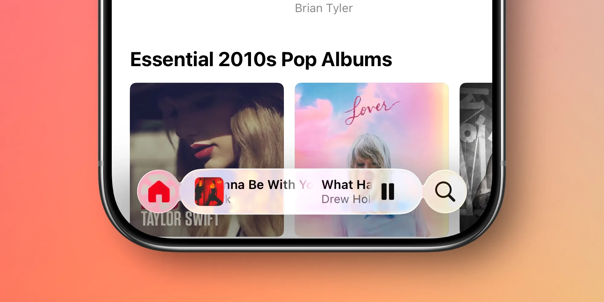
To me, the biggest issue lies in the Music and Podcast apps. The MiniPlayer frequently shrinks, and you have to tap the navigation bar to access the main control buttons.
Additionally, I am quite tired of the constant need to tap to fully reveal the navigation tab bar. Even if Apple doesn't change the default for everyone, I would love to have a setting that prevents the tab bar from ever shrinking again.
What changes would you like to see for the Liquid Glass design in iOS 27? Share with us in the comments.
Best iPhone Accessories
- AirPods Pro 3 (now only $199, down from $249)
- MagSafe Car Mount for iPhone
- 10-Year AirTag Battery Case 2-Pack
- 100W USB-C Fast Charging Adapter
- Apple's New AirTag 2 (Single / 4-Pack)


Comments
(10 Comments)