iOS 26.4, when released last month, brought many new features and changes. Among these changes are innovations in the design of Apple Account screens in several system applications. Here are the changes.
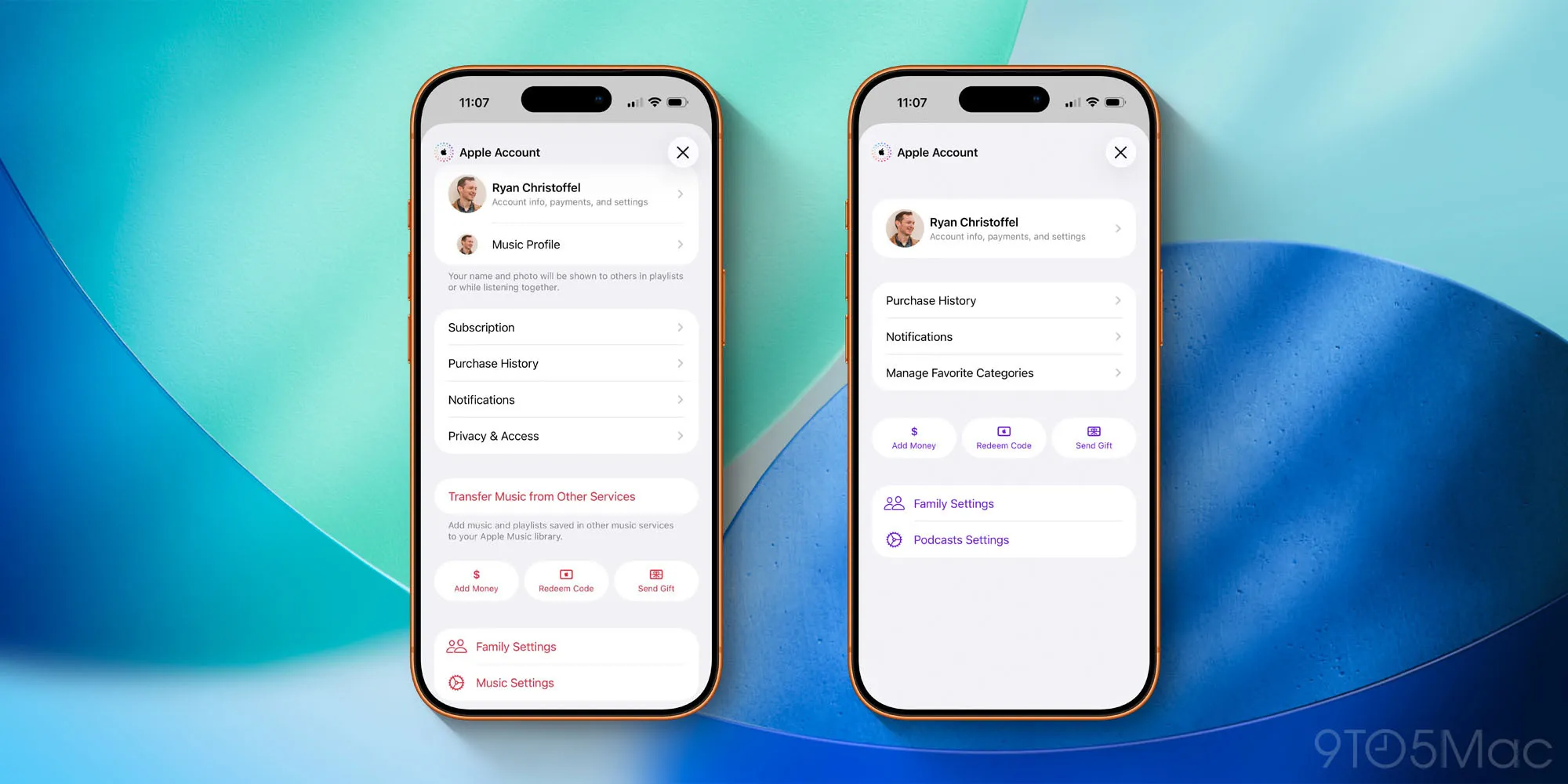
The design of Apple Account menus with iOS 26.4 offers better organization, consistency, and visual innovation
Recently, Apple rebranded Apple IDs as Apple Accounts. However, you may not have noticed this change as it was largely limited to online support documents and web pages.
But with iOS 26.4, the company made the first significant changes to how various Apple Account details are displayed on the iPhone.
To browse, open one of the following applications:
- Music
- Podcasts
- TV
- App Store
Then, tap your profile picture in the top right corner to load the Apple Account menu.
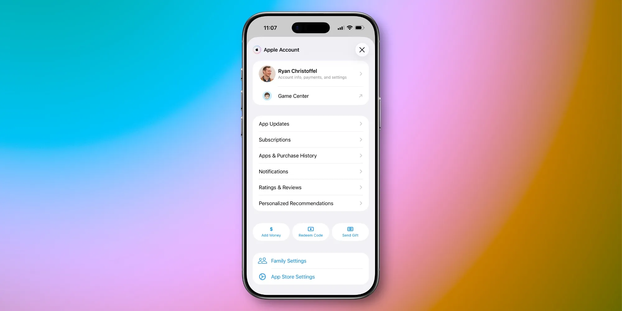
The new design of these Apple Account pages is shown above; there are examples from Music, Podcasts, and the App Store.
If you are wondering what changes have been made, there is still at least one example of the old design in iOS 26.4.
In the Apple Books app, Apple has not yet adopted the new Apple Account design. I hope this changes in a future update.
The appearance of the Books app is as follows:
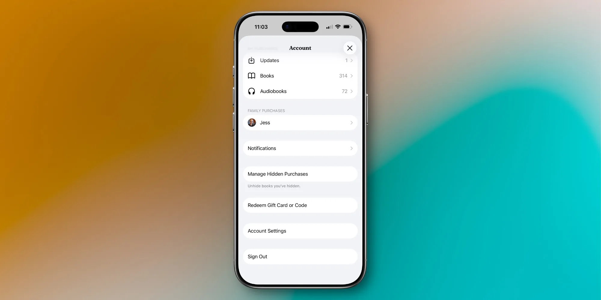
As you can see, the old design has many random options, but there is not much organization among them.
Meanwhile, the new design features common groupings of menu items across different applications, new options like 'Add Money' and 'Send Gift', and a bit more visual appeal than what was previously available.
This is not a major overhaul, but the design changes in iOS 26.4 make these Apple Account centers more user-friendly and consistent.
What do you think about the new Apple Account page designs in iOS 26.4? Share with us in the comments.
Best iPhone Accessories
- AirPods Pro 3 (currently only $199, down from $249)
- MagSafe Car Mount for iPhone
- 10-Year AirTag Battery Case 2-Pack
- 100W USB-C Fast Charging Adapter
- Apple's new AirTag 2 (Single / 4-Pack)


![The CardPointers app can now integrate with ChatGPT and more [50% off]](/resimler/cardpointers-uygulamasi-artik-chatgpt-ve-daha-fazlasi-ile-entegre-olabiliyor-yuzde-50-indirim.webp)


Comments
(10 Comments)